

ux/ui design
interaction design
Academic app concept
April 2022
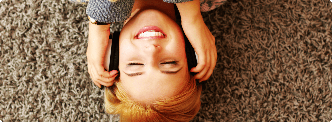
The concept starts from a brief user research in which the needs of the users are explained and specified to whom the app must propose solutions: interactive and personalized service, quick accessible content, easy-to-use app and in line with needs and user expectations.
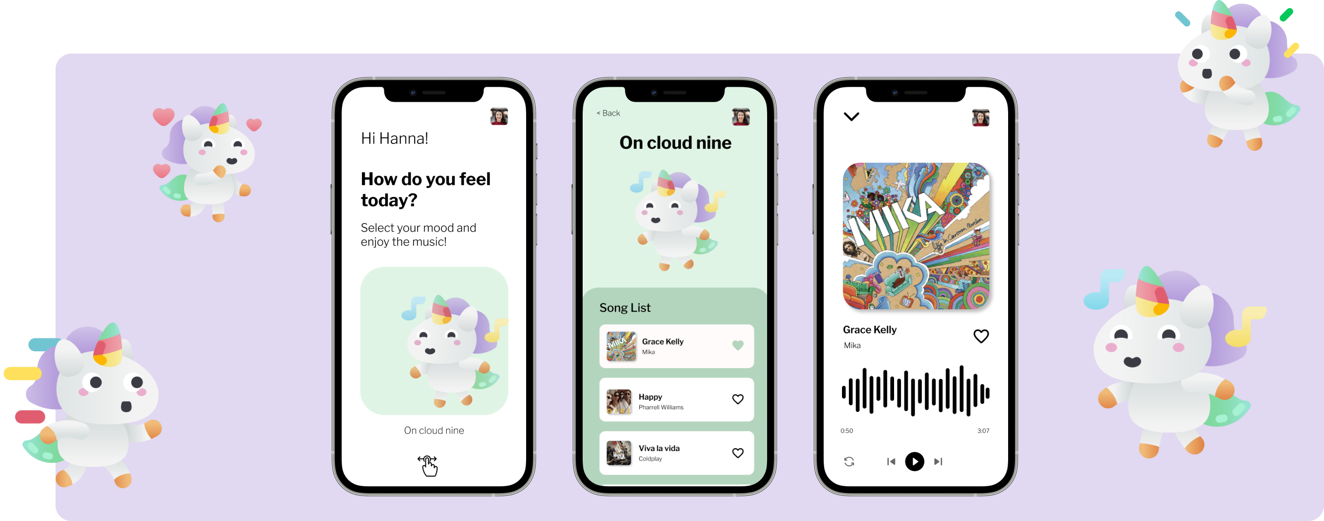
The app will be divided into six different moods and in each section the user, once logged in, can choose the mood and start listening to the suggested playlist or go to his profile and select a playlist saved or created by him.
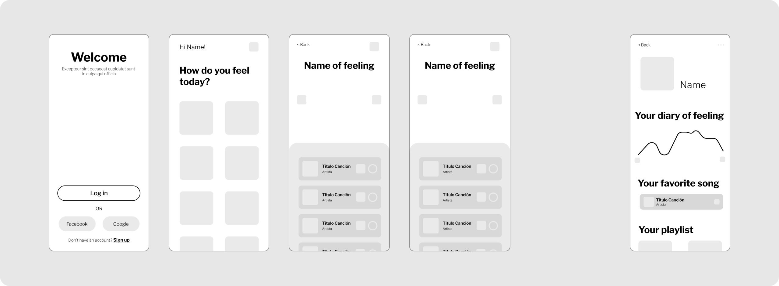
A lo-fi wireframe can be a very useful tool and is intended to convey concept, identify the structure of a website or app, organize elements, and spot possible layout issues.
Using wireframes is highly recommended because they allow you to focus on usability and user experience, rather than the aesthetic aspect.
Before refining the style and interaction details, it is useful to prepare the wireframes: starting model for designing the key screens and the user interface in order to increase user satisfaction and improve the effectiveness of the interface.
Keeping the users' goals in mind, I structure the wireframes by uniting the information hierarchy with the functional elements and specific usability flows. This step helps me visualize what the app's functionality will be and how it will interact with the user.
So I've sketched out the most important wireframes as a visual guide to illustrate how the app will work.
The Design System is a powerful tool composed of a collection of components, principles and guidelines intended for the design of digital products with the aim of ensuring a consistent experience for the end user.
By complying with these guidelines, the user will be able to benefit from high usability, a simple and fast browsing experience and a feeling of familiarity in using the service or digital product.
In this phase of the design process I conduct a benchmark and research to get ideas on colors and typography to use and animations.
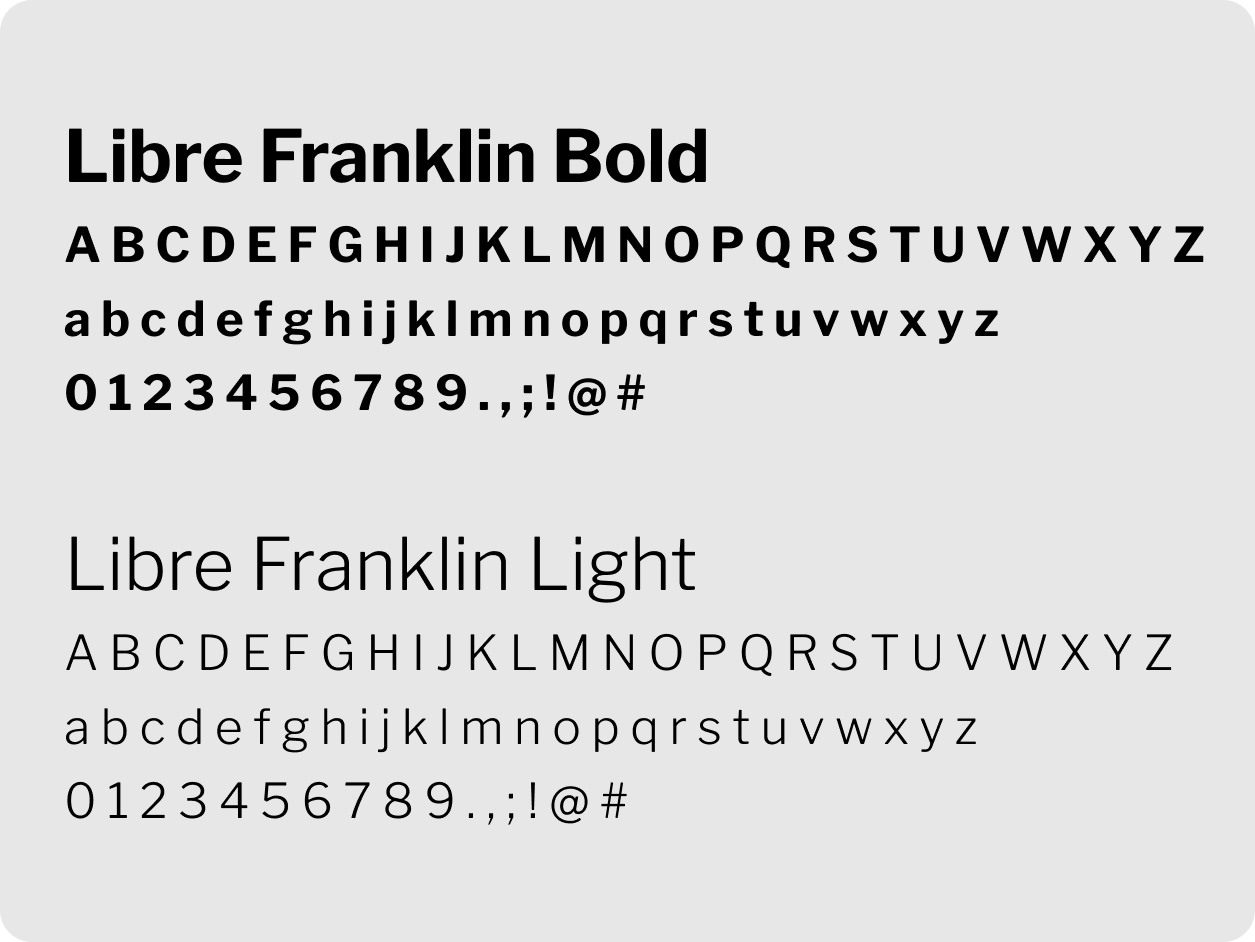
I chose a typeface belonging to the sans-serif family and set the titles bold and a second lighter typeface for the body to promote visual hierarchy, legibility and accessibility of the content.
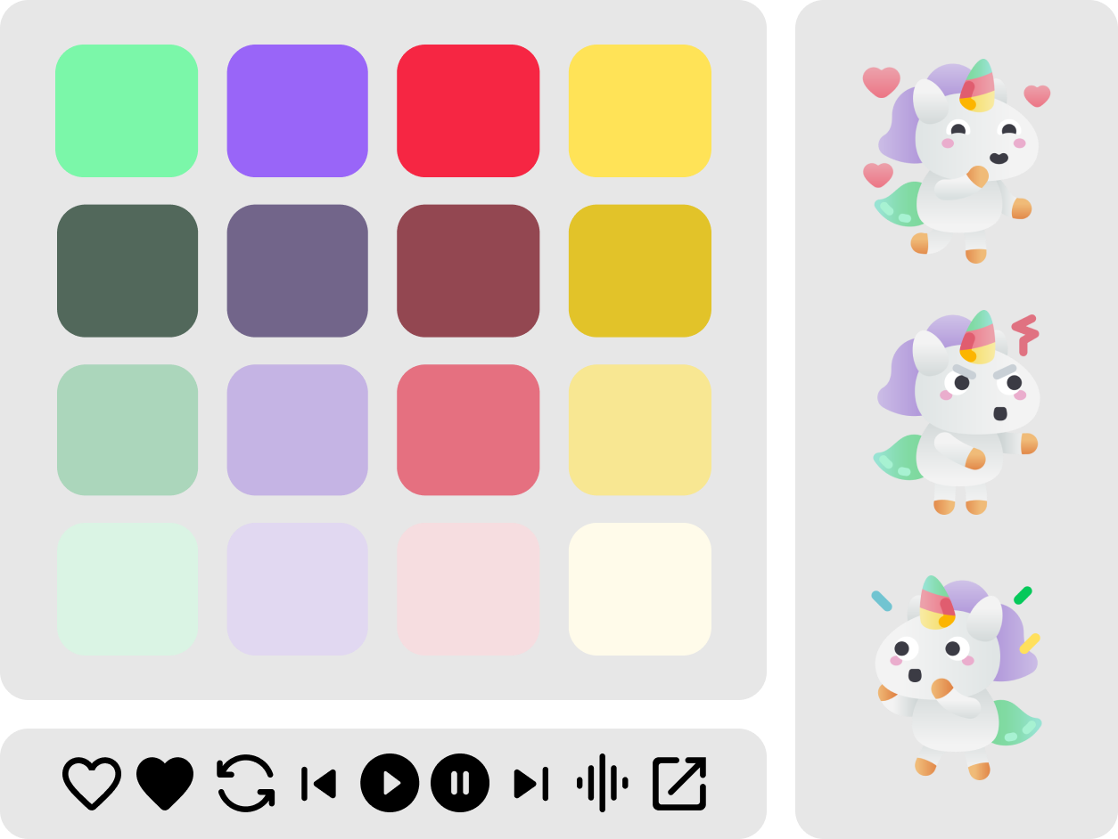
As for the color palette, a gray scale predominates, as secondary colors are assigned to moods, represented by playful and fun unicorn illustrations, which reinforce the text. To complete the app's Design System, I focused on the style of the icons and opted for a simple style with rounded corners as well as the buttons.
The last step to make the app functional was to think of interactions and animations in order to improve the user experience and produce positive sensations that unconsciously influence the users' actions. To achieve this I have used micro-interactions useful to generate an emotional connection between the user and the product and to warn that there is an action in progress.
Just send an email. I’d love to join your design team for the next project to build great products together!