

ux/ui design
web design
Agency project
September 2022
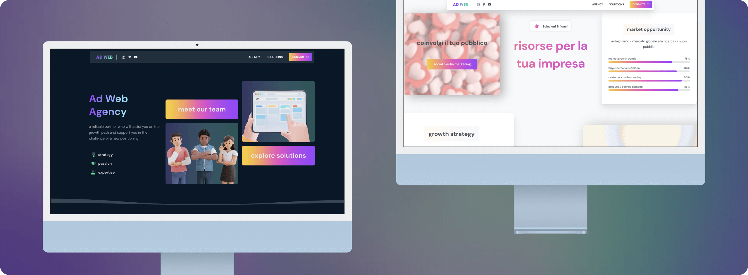
The concept starts with a brief with the agency in which the objectives of creating a new website for the agency are explained and specified: the new website must be a showcase but also a place to promote the services that Ad Web Agency offers to its clients and future clients.
The site will focus mainly on the projects, without neglecting the canonical pages such as the about page, where it will explain in detail who the agency is and its team, the services page, where the services offered will be better explained, and the contact page.
A CMS (Content Management System) is an application that allows websites to be created by means of a user-friendly graphic interface: it gives users the possibility to create, edit and manage a dynamic site easily, using simple commands.
In addition, the use of a CMS considerably lowers management costs and halves implementation time.
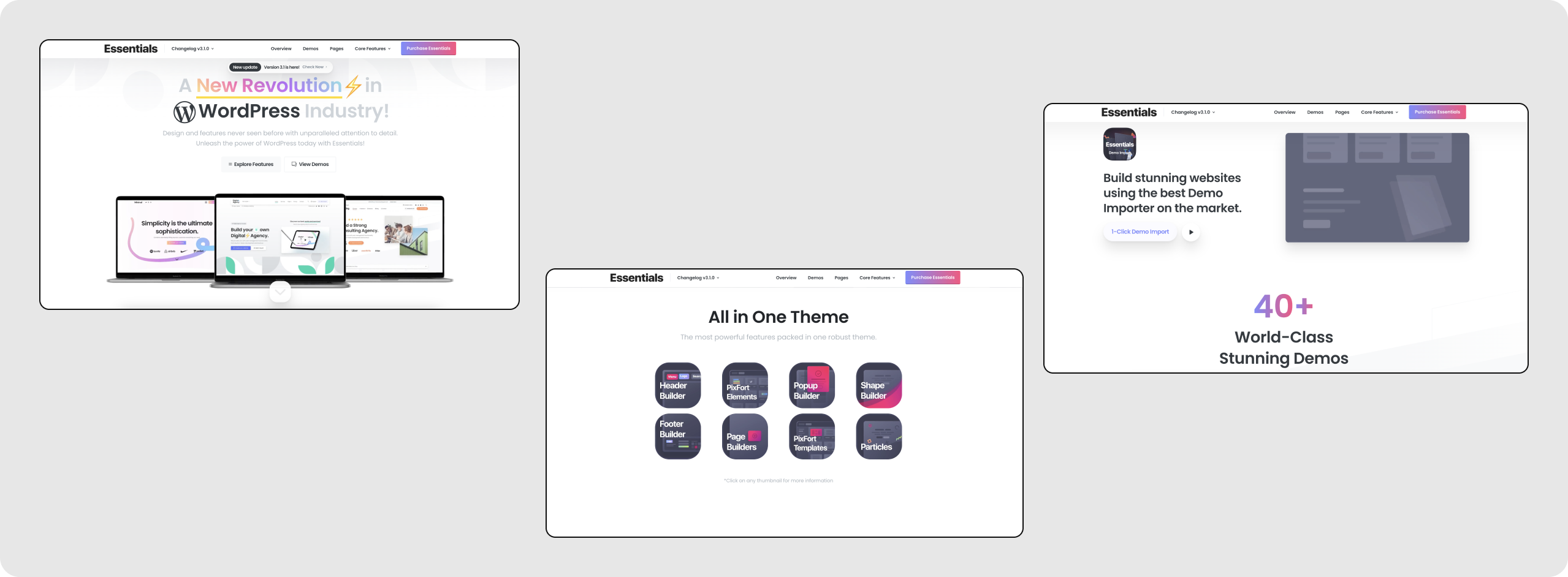
As this was a site that had to go live as soon as possible, we decided to use a Wordpress theme as a basis. By relying on a CMS system without having to develop the site itself from scratch, we were able to significantly lower management costs and production times, and use a tool that was always up-to-date.
The search focused on themes that had a dynamic and fresh structure according to the promotion and showcase objectives of the portfolio. After analysing several themes, we chose Essential by pixfort, a young theme with a lot of variety, a very rich library and well stocked with innovative elements and animations.
The theme in fact comes with numerous demos, from which one can easily import the elements one likes, and the integration with Elementor Pro allowed us to integrate numerous exclusive features and elements to create the best user experience.
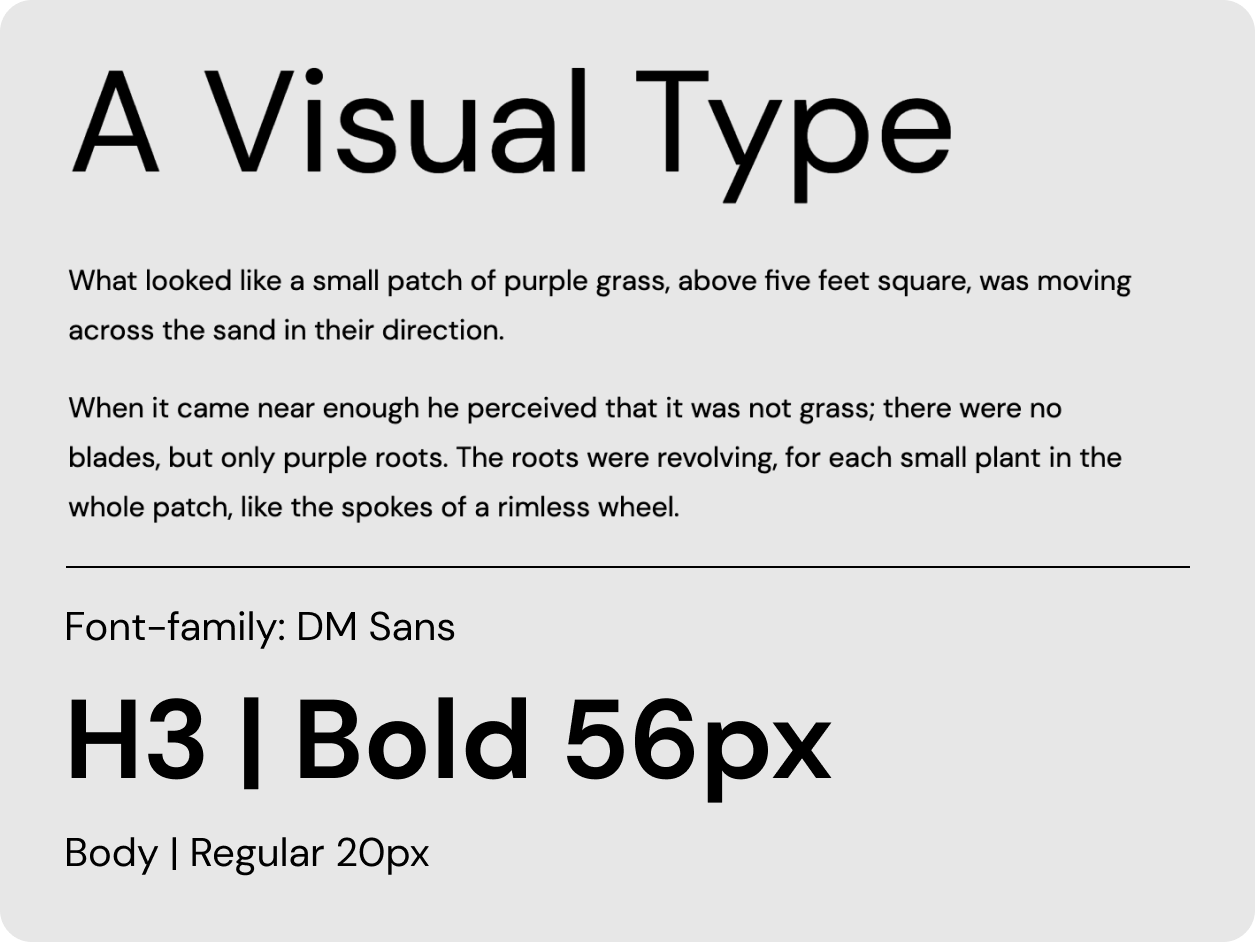
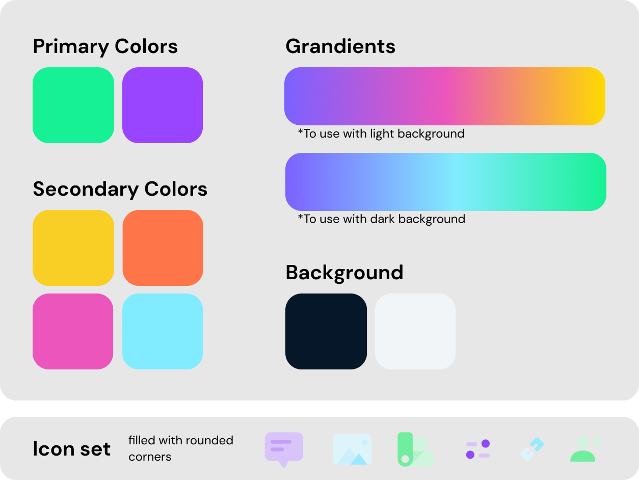
In this case, the brand already existed with its colours, typography and icons. The process of creating the Design System was a simple adjustment and adaptation of the existing elements to the needs of the site. First a color hierarchy was chosen by identifying the main colors, secondary colors and alt colour. Next I identified a typographic scale by specifying for each headings the font size, font weight and line spacing.
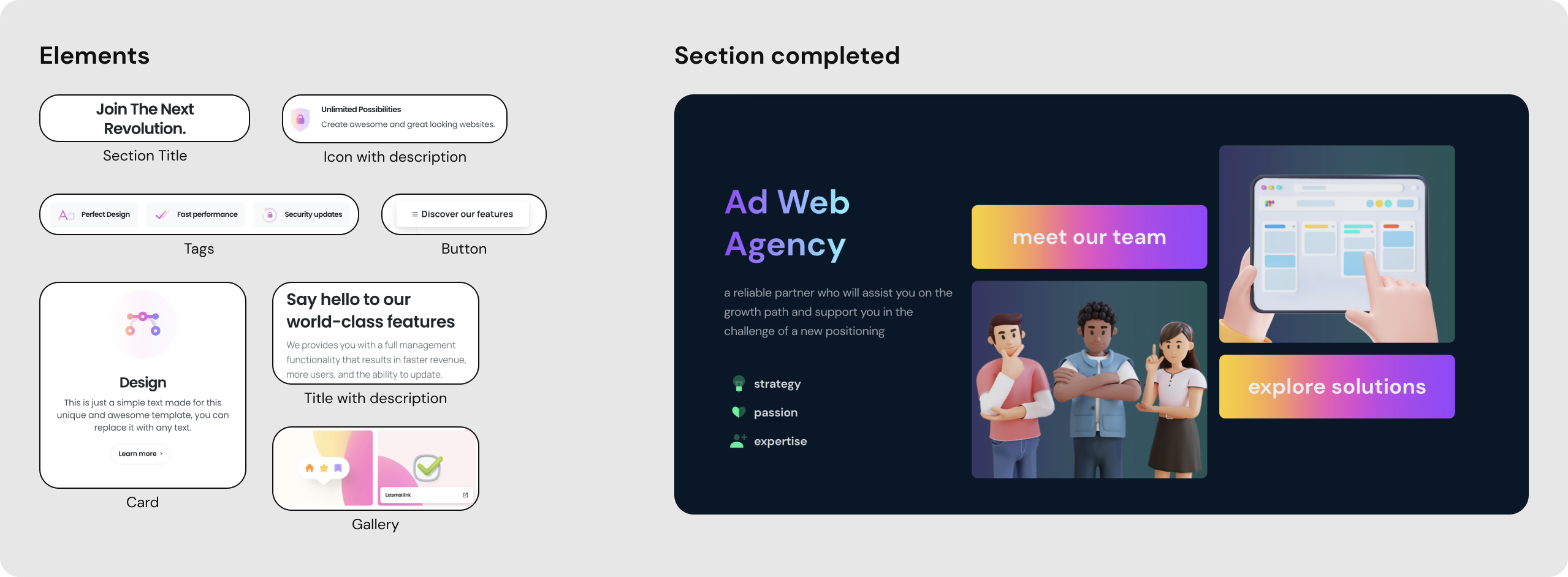
A little further thought was given to the images and the style to be used for the illustrations. So we opted for a style mainly based on real images for the projects and for all the rest we thought about the 3d illustrations, following the trend of the moment.
Once I had defined the Design System and chosen the demos that best reflected the characteristics of Ad Web Acengy, I set the theme option and started to build the pages.
I first selected the elements that I considered useful according to the style, then I arranged them in order following the storytelling I had thought up, and finally I gave life to each page by following the site navigation, defined beforehand.
The last step was to test and verify that all pages of the site were ready to go live. Starting with a text check, we went on to check the various links and finally tested the performance of the site. Once we passed these checks with flying colors, we put the site online.
visit the website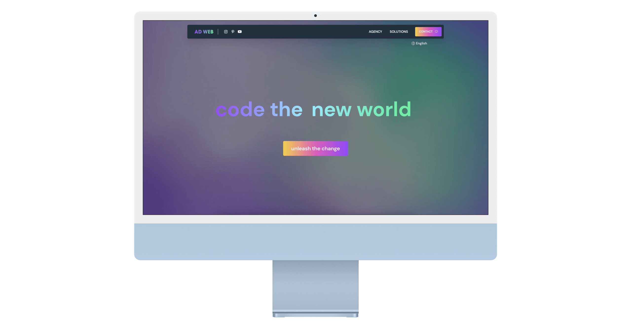
Just send an email. I’d love to join your design team for the next project to build great products together!