

ux/ui design
web design
brand design
Agency project
February 2023
The client is an entrepreneur who has opened a new business selling new and used semi-trailers. The objective is to create the brand, corporate image and website (already set up to accommodate a future ecommerce). The brand must convey reliability and bring back the world of transport. Consequently, the site must be a showcase of the products available, make the brand known as a leader in the purchase and sale of heavy goods vehicles, and convey trust. In addition to the product pages, the about page and the contact page, the point of contact between customer and company, were developed.

Values are the soul of brands, the reason they exist, and they influence the whole business: communication, marketing, purchasing, sales, decisions and relationships.
According to a study conducted by Accenture, 71% of Italians prefer to buy from companies with values aligned with their own ideals and opinions. in addition, 61% say that their purchasing decisions are influenced by the values, words and behaviour of company leaders.
Discovering brand values together with client is therefore vital because they help to create a deep connection with customers, stimulate a sense of belonging and activate emotions and actions.
Starting from the values that the brand wants to convey such as uniqueness, landmark, security, Latin origins and internationality (as the naming also suggests), symbols that could represent them were heavy:
- hexagon: perfect geometric module for space management, in ancient symbolism it represents harmony and balance;
- arrow: material index of direction: it is the needle of the compass that always points north, so as never to lose orientation;
- asterisk: a graphic sign already in use in Latin codes, it is placed next to a word or number to which attention is drawn;
- shield: symbol of defense par excellence and protection, it encloses the asterisk/hexagon, reinforcing its meaning.
Here, the hexagon, used as an area for the creation of the asterisk formed in turn by two arrows, are enclosed in the shield, giving life to the brand mark.
Brand Manual

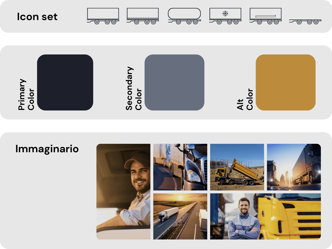
The Palette is characterised by the combination of the neutral colors on the one hand and the distinct vividness of gold on the other. The colors associated with the idea of hardness and resistance, are considered the elements of par excellence that best represent metal. They are used in different contexts to express elegance and refinement, particularly gold.

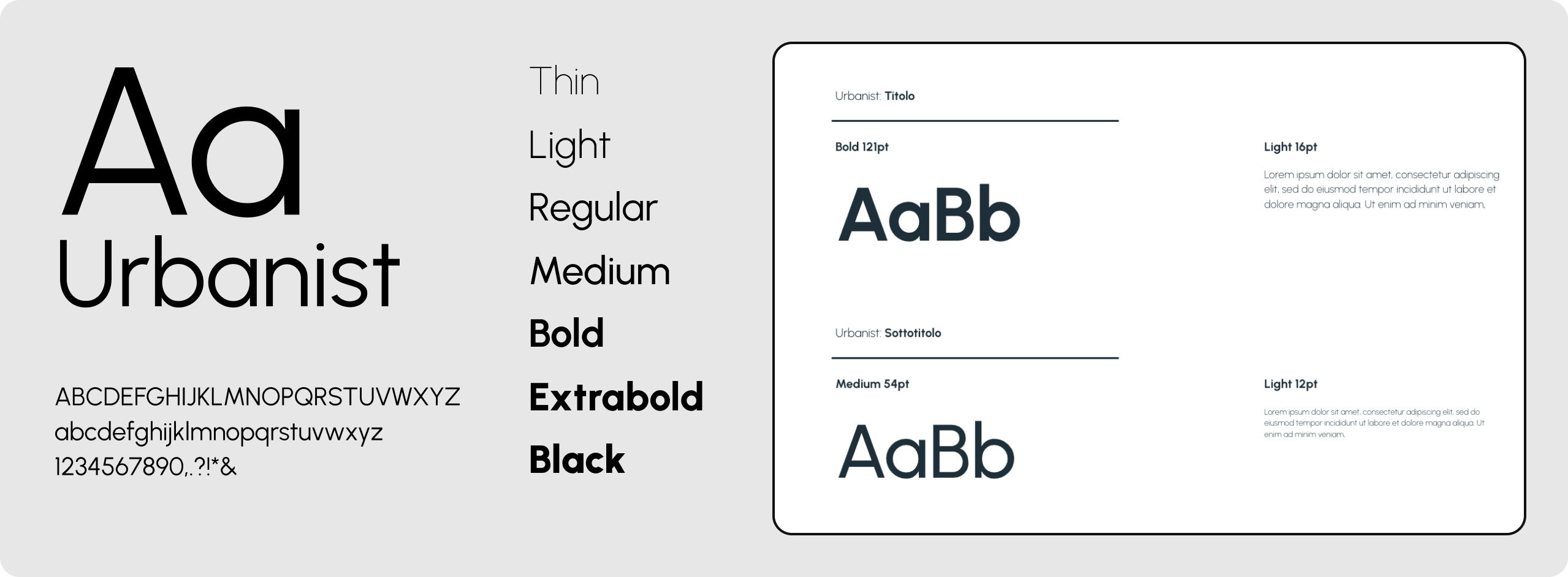
The typography chosen to match the visual symbols and colors is a sans-serif font characterised by a low-contrast geometry inspired by modernist typography and design: Urbanist. Consisting of elementary shapes, it is characterised by a particular geometric construction reminiscent of perfection, structure, weight and balance, without neglecting a touch of modernity.
In order to identify the proportions of the various typographical elements, the Perfect Fifth typographical scale was used, which allows one to play with different weights and sizes, reinforcing the values linked to the brand and the imagery one wishes to evoke.
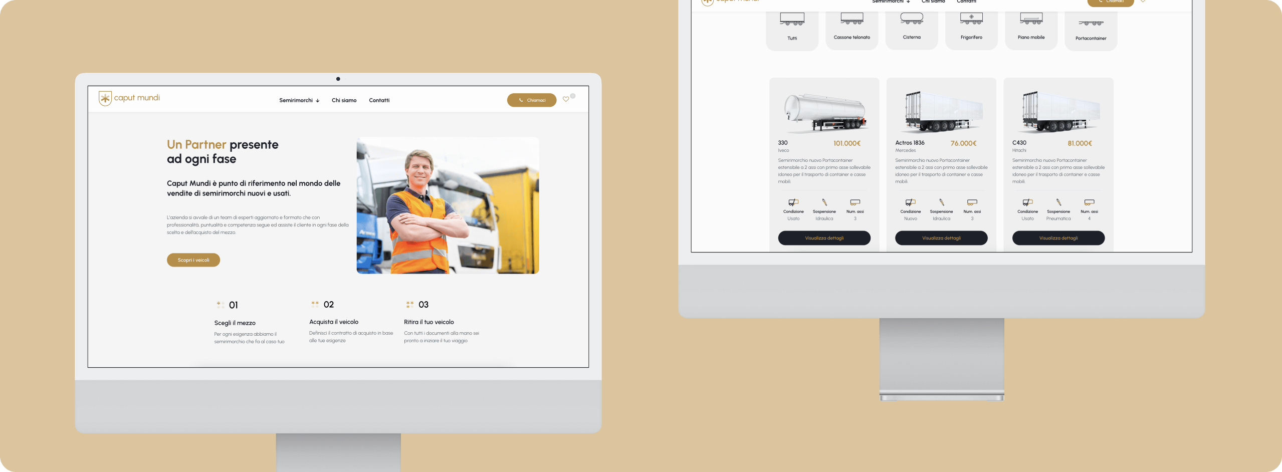
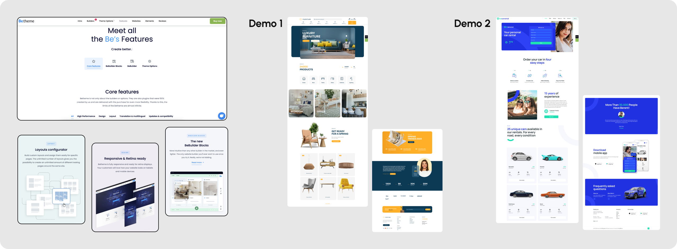
As this was a site that had to be up and running as soon as possible, we decided to use a Wordpress theme. In order to choose the most suitable theme and according to the idea we had in mind, we first searched for benchmarks found one that fully reflected our requirements and the visual we had in mind: a showcase site for the purchase of various types of semi-trailers, for different areas of use and an ideal place to ask for advice and find assistance.
The search thus focused on themes that had a dynamic and friendly structure, with rounded elements and easy usability. After analysing several themes, we chose Betheme, one of the most widely used cms, fresh, always up-to-date with the trends of the moment, a very rich library and well stocked with innovative elements and animations. The theme comes with numerous demos, from which you can easily import the elements of your liking thanks also to its user-friendly page builder.
In particular, two demos were chosen: the first, because it was closer to the bench in terms of layout and structure; the second, on the other hand, already had content more consistent with the Caput Mundi subject.
The process of creating the Design System was an adaptation of the elements identified in the Brand Manual to the needs of the site. First a color hierarchy was chosen, identifying the main colors, the secondary colors and the alt color. Then I applied the typographic scale of the Perfect Fifth, specifying for each title the font size, font weight and line spacing.
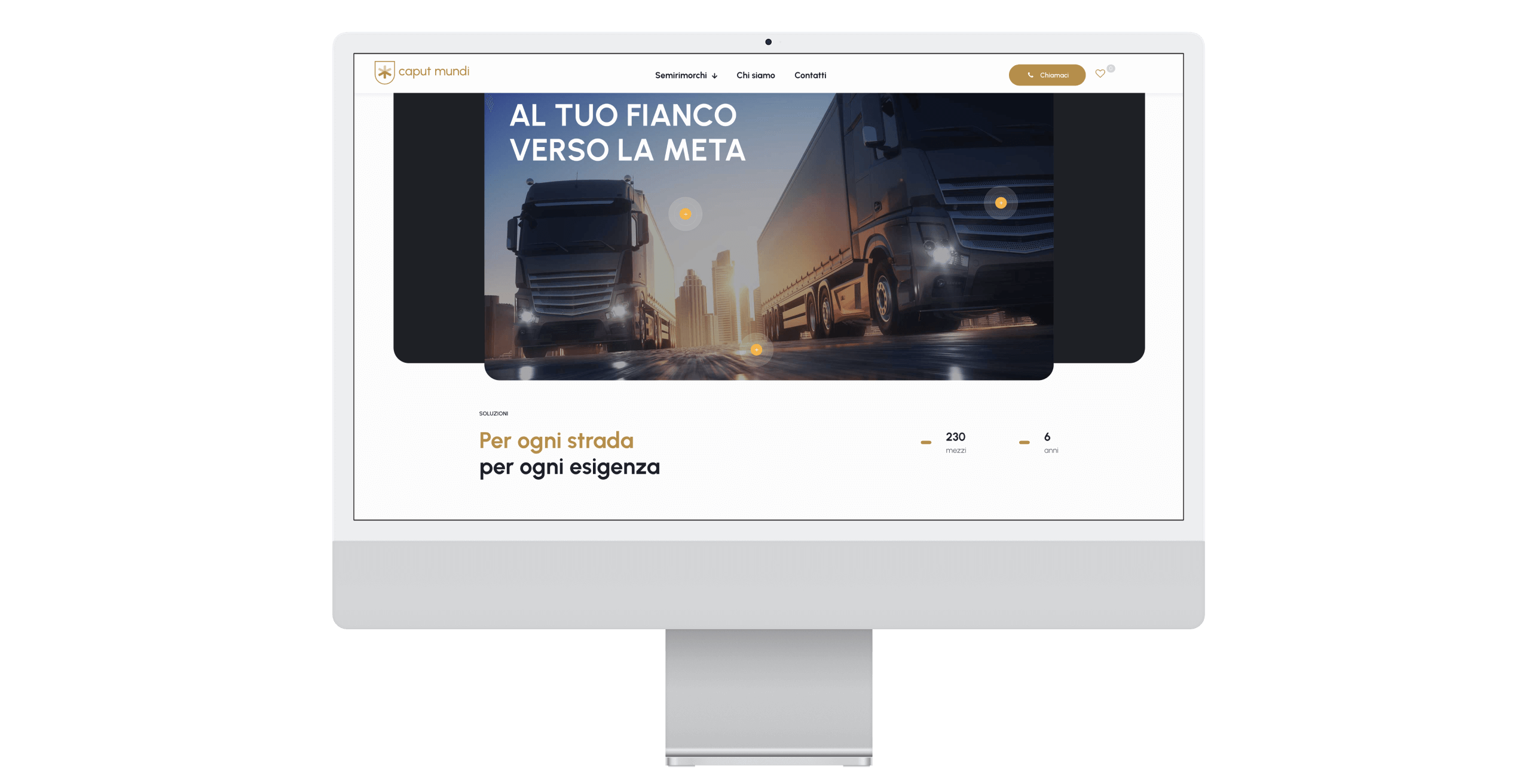
Further thought was given to the images and the style to be used. I therefore opted for a style based mainly on real images that conveyed a precise message: to be a reliable travelling companion.
The images associated with the brand therefore tell the story of these vehicles, their power, the kilometres travelled every day, the roads travelled, the territories visited and the experiences of the people who drive them.

Once I had defined the Design System and chosen the demos that best reflected the characteristics of Caput Mundi, I set the theme option and started to build the pages.
I first selected the elements that I considered useful and in line with the style, then I arranged them in order following the storytelling I had thought up, and finally I gave life to each page by following the site navigation, defined beforehand.

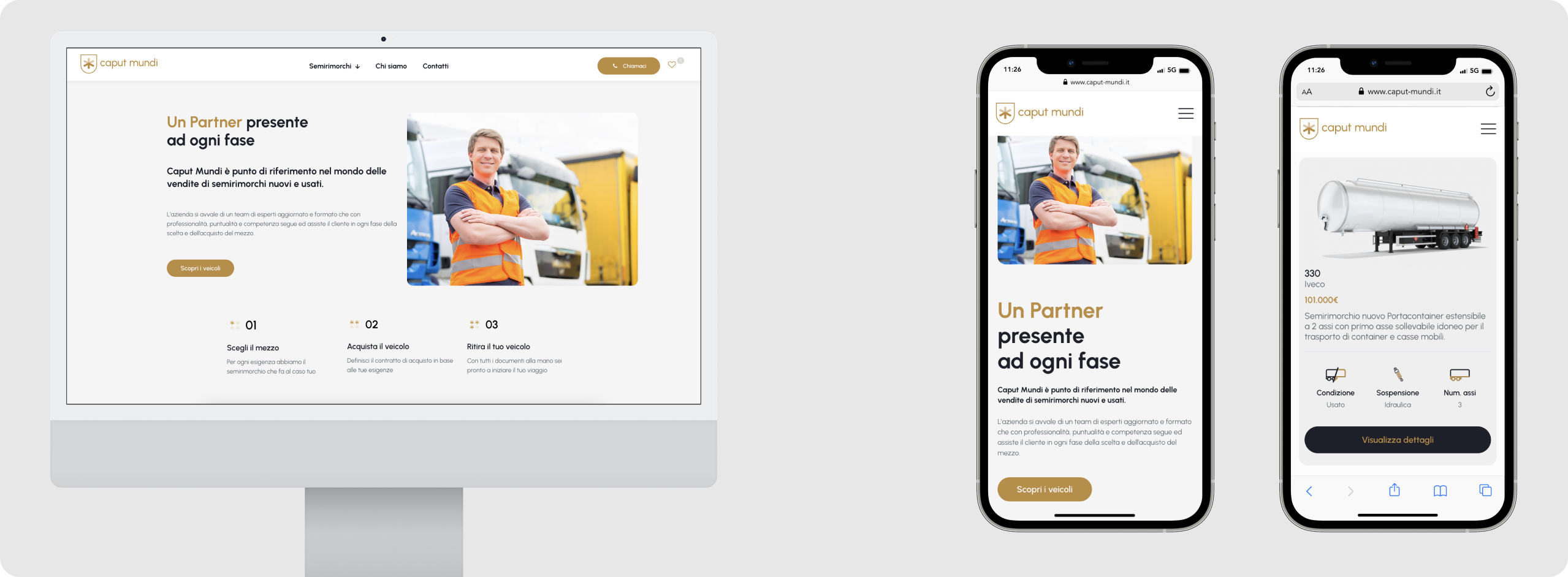
In the field of web design, the term 'responsive' is used to refer to the layout of a site that is able to change in size and usability, guaranteeing the user an optimal user experience regardless of the screen size of the device being used.
This is why the saying 'mobile first' is a very common practice. In fact, it is a good idea to develop the layout and user experience of a site starting precisely from the use that the user will make of the product from a mobile device.
Special attention was paid to responsiveness of the website because a key point for the client was the use of the platform on mobile.
So once the pages were set up and the content inserted, we focused on this aspect, ensuring that on all devices the user experience remained consistent and visually correct. Where this was not the case, we went to correct and customise those elements that did not fit the device.
The last step was to test and verify that all pages of the site were ready for publication. Starting with a text check, we went on to check the various links and finally tested the performance of the site. Once we passed these checks with flying colors, we put the site into operation.
visit the website
Just send an email. I’d love to join your design team for the next project to build great products together!
