

brand design
web design
Agency project
March 2020
The client is an entrepreneur who has recently acquired companies with the aim of merging them into a single holding company and listing on the stock exchange. The challenge was to renew the brand for the new holding company, the corporate image and the website.
The brand is linked to concepts such as excellence, innovation, district, elegance and proactivity. Values that had to be conveyed by the new logo and integrate with the lines of the old logo.
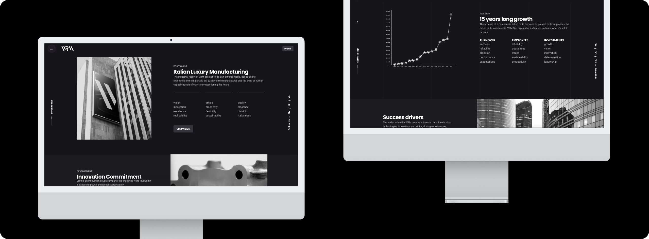
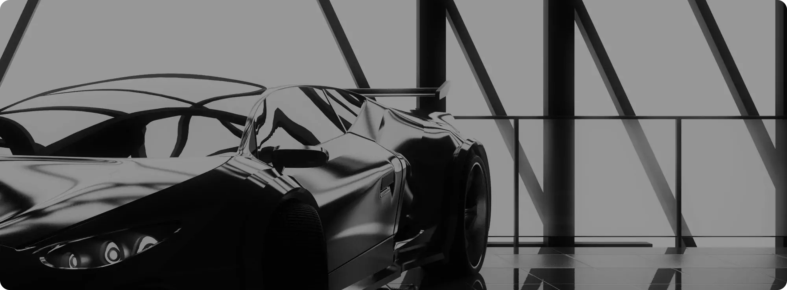
As a result, the site tells the story of the company, its mission and vision, its commitment to achieving perfection and its partnership with leading automotive brands. For this reason, the canonical about (transformed into vision and district) and contact pages were developed, and investors and techonology pages were added to arouse interest not only in a prospect but also in a future and possible investor.
Rebranding is the process of strategically changing a company's brand identity. As it is therefore associated with the need for a change in the Brand Image, it is recommended to use it when the company has experienced growth or renewal; has changed its target audience or reference market; has purchased other companies; or for simple ageing.
This strategy can be implemented in two ways:
- Evolutionary rebranding: a more subtle and less perceptible change, which is carried out by intervening on the graphic elements (Marketing Aestethics) such as the logo, typeface or brand colors;
- Revolutionary Rebranding: a clear and radical change, which transforms the value proposition and positioning of the brand on the market (Positioning).
The rebranding phase began with a study of the previous logo to see if certain aspects could be used and passed on: the base of the new logo is in fact a 65° inclined module obtained from the letter 'V' of the old logo.
Furthermore, by identifying geometric rules, we ensured that the brand had a proportionate division of space and visual weights. In this way, the rhythmic design conveys VRM's key concept: the flexibility of the design conveyed through modules that can be applied in different scenarios.
Finally, starting with a sans serif font, we rethought the letters of the naming, giving the new logo a more elegant, attractive and innovative look.
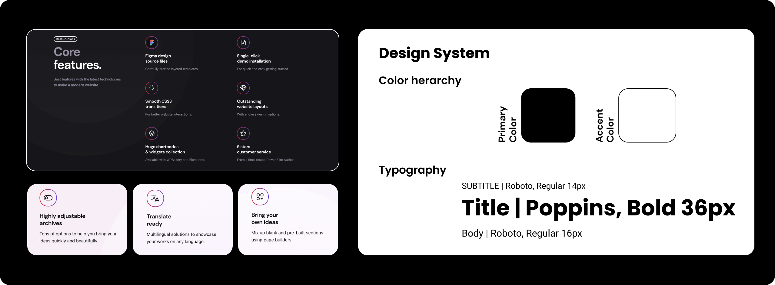
Brand ManifestoThe Institutional Chromatic Palette emphasises the use of tones that visually recall importance and authority. Using predominantly the color black and white in this context evokes the values of innovation, luxury, technology, integration.
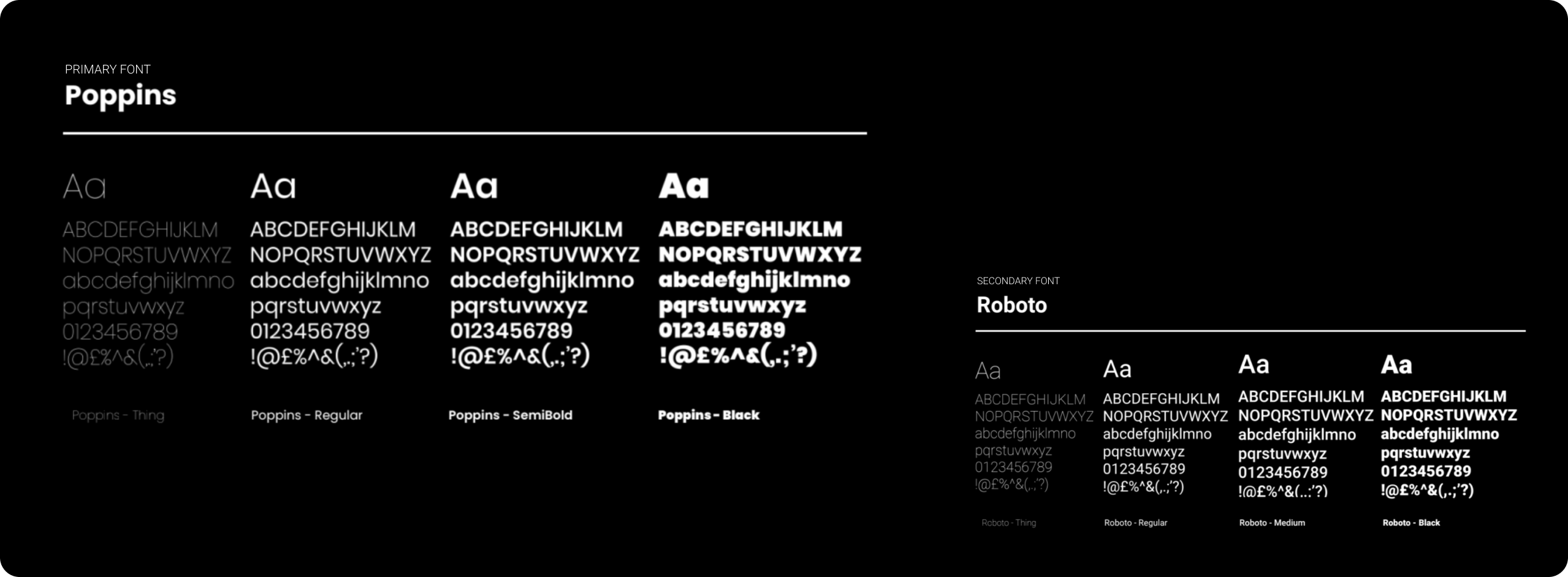
The primary typeface chosen for the brand belongs to the sans serif font family: Poppins Geometric. In the long tradition of sans serif fonts, Poppins is a newcomer with an internationalist outlook. Its design is purely geometric and has a wide range of weights.
It has been joined by another sans serif font: Roboto. Roboto has a natural reading rhythm typical of humanistic typefaces due to its dual nature: one, it has a mechanical structure and its shapes are mainly geometric; the other, gentler, has open curves and friendly curves.
To ensure ease of use for the customer and constant updating, we decided to rely on a CMS to build the site. The search for a Wordpress theme therefore focused on demos that had a dynamic, innovative, original and easy-to-use structure. After analysing several themes, we chose Ohio, one of the most widely used thanks to a well-stocked library of elements and animations and with great customisation possibilities.
TThe phase following installation was to set the theme through the Design System, which in this case was an adaptation of the elements identified in the Brand Manifesto to the needs of the site. First a color hierarchy was chosen, identifying black as the primary color and white as the accent color. Then we applied the typographic scale, specifying the font size, weight and line spacing for each title.
The last step was to test and verify that all pages of the site were ready for publication. Starting with a text check, we went on to check the various links and finally tested the performance of the site. Once we passed these checks with flying colors, we put the site into operation.
visit the website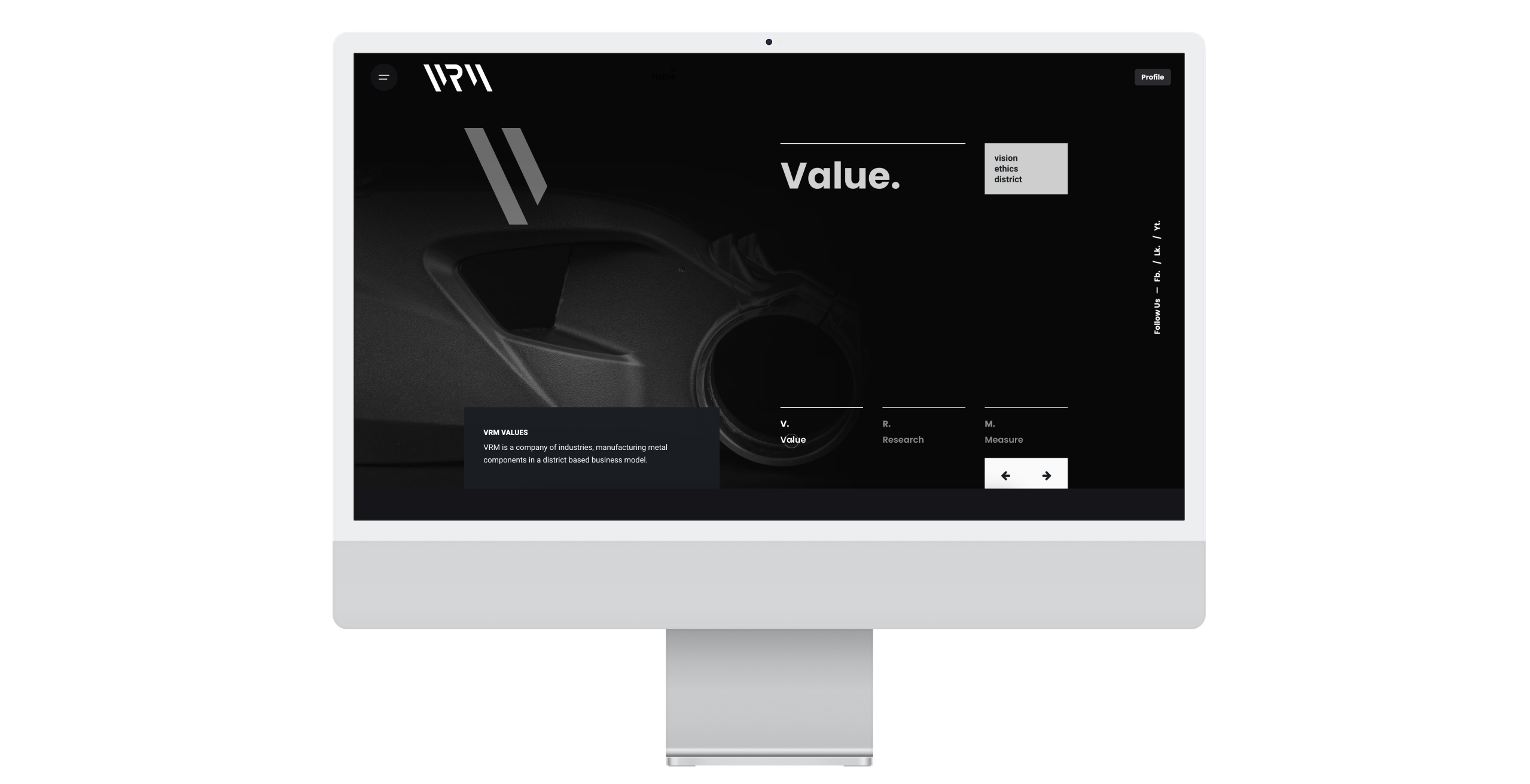
Just send an email. I’d love to join your design team for the next project to build great products together!